Bravure Group
Bridging users interactions.
Role / Process
Discovery and research
UX/Ideation
Design strategy
Design rollout
Developer collaboration
Tools
Figma
Shortcut
Bootstrap
Bravure Group develops and executes strategies that help their partners solve the most complex challenges within collections, debt recovery, and insolvency.
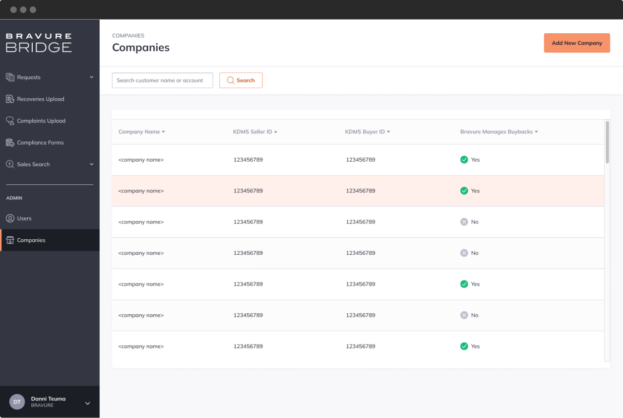
Bridge (by Bravure) provides a streamlined way of managing the many hundreds of requests and data transferred between buyers and sellers after sale; including buybacks, requests, and compliance reporting.
My role
As Senior UX/UI Designer for Soda Digital, I led the design and strategy through a complete lifecycle—from initial discovery and UX testing, through to creative design execution and oversight of the engineering process.
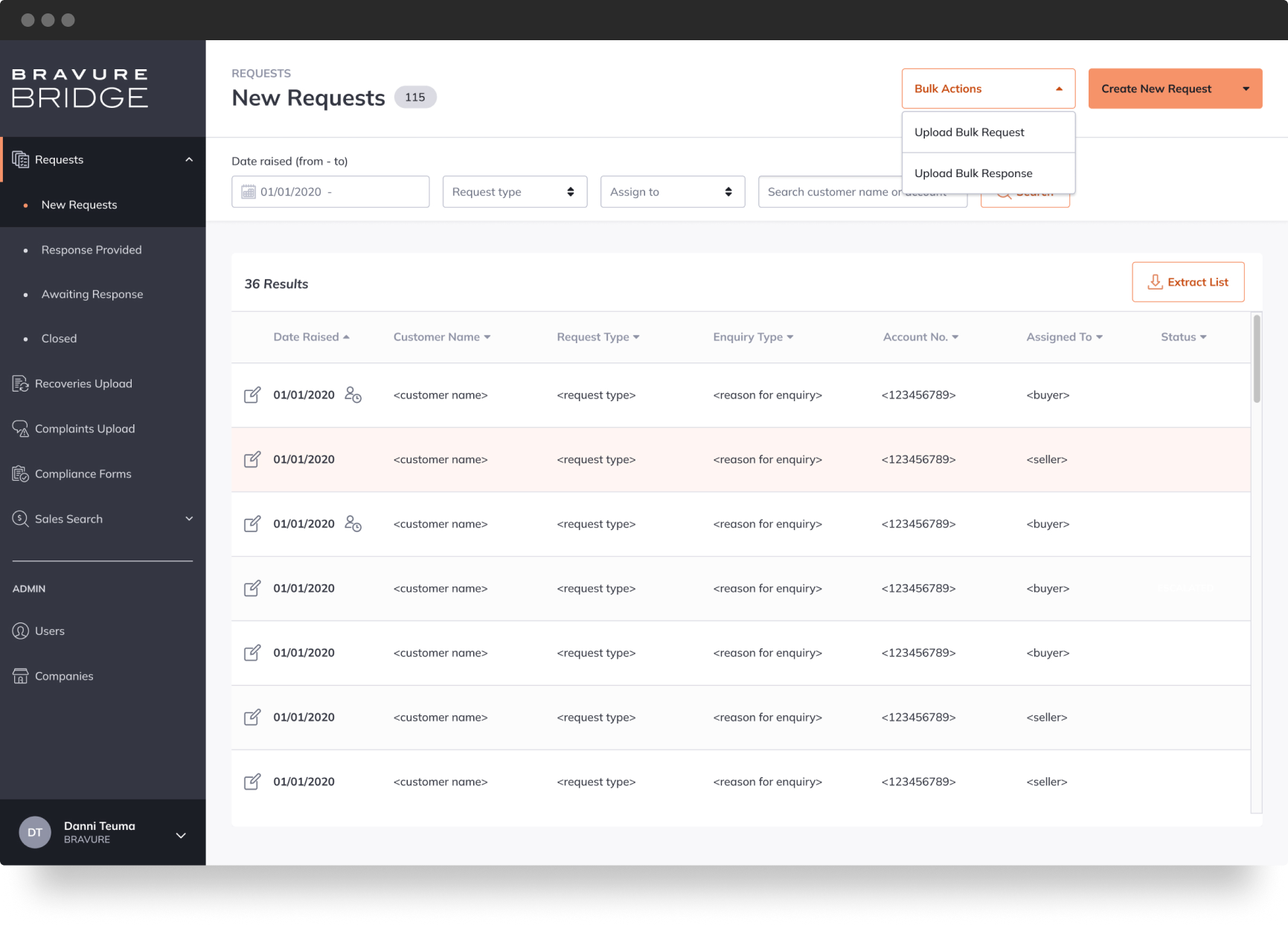
The problem space
Imagine running hundreds of transactions between multiple buyers and sellers, using a poorly supported and aging third-party product that effectively generated spreadsheets. Millions of dollars worth of transactions costing Bravure in lost administrative hours. While errors were not overly common, their risk for both financial and reputational damage was always present.
Solution
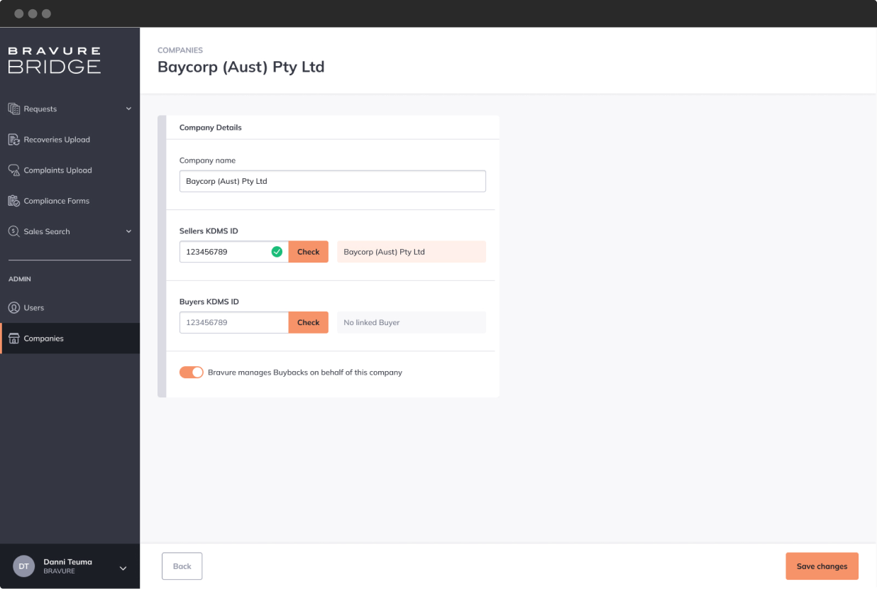
Bravure engaged Soda Digital to design and develop a bespoke platform for creditors and debt buyers to improve the compliance, oversight, and post-sale support.
Creating a self serving platform, creditors and buyers could then execute and manage their many transactions using an easy, intuitive user interface. Bravure could also mediate and view transactions, and intervene where required. Errors and discrepancies would be captured and reported, minimising risks and administrative oversight.
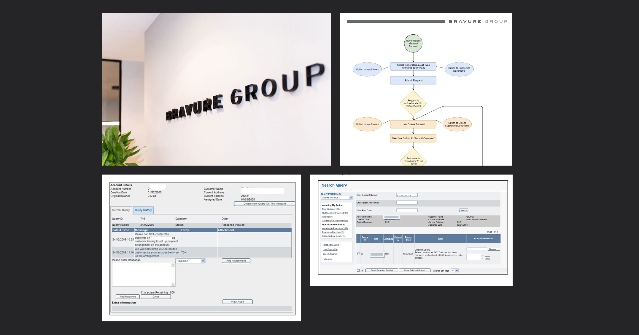
Strategy & Process
From the outset my strategy was to gather our engineering team with the client, understand each others expectations, and build trust. Through this process we aligned on the shared problem space and outcome, developing a collective buy-in.
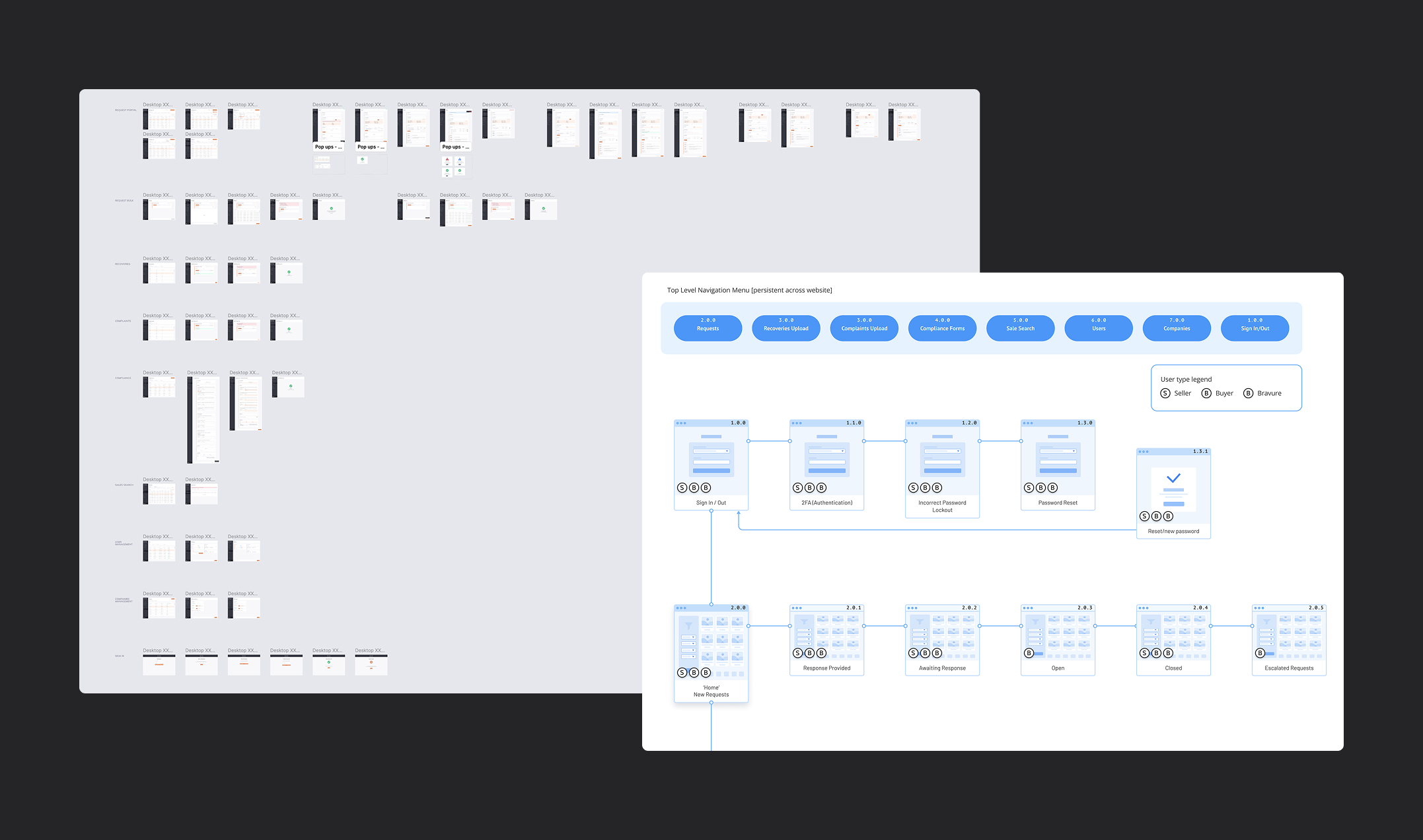
Working closely with the Bravure team, I started by leading research to understand the complexities of the transaction types, and how different users, such as creditors and buyers, needed to interact along the way. Each interaction I captured as a workflow process, which was tested with clients expectations.
By understanding these complexities I was able to model a series of workflows prior to design that explored IF-AND-OR statements to know what steps needed to be accounted for and where potential pain points existed. This planning allowed us to be more agile and flexible in our development, and pivot if and when required.
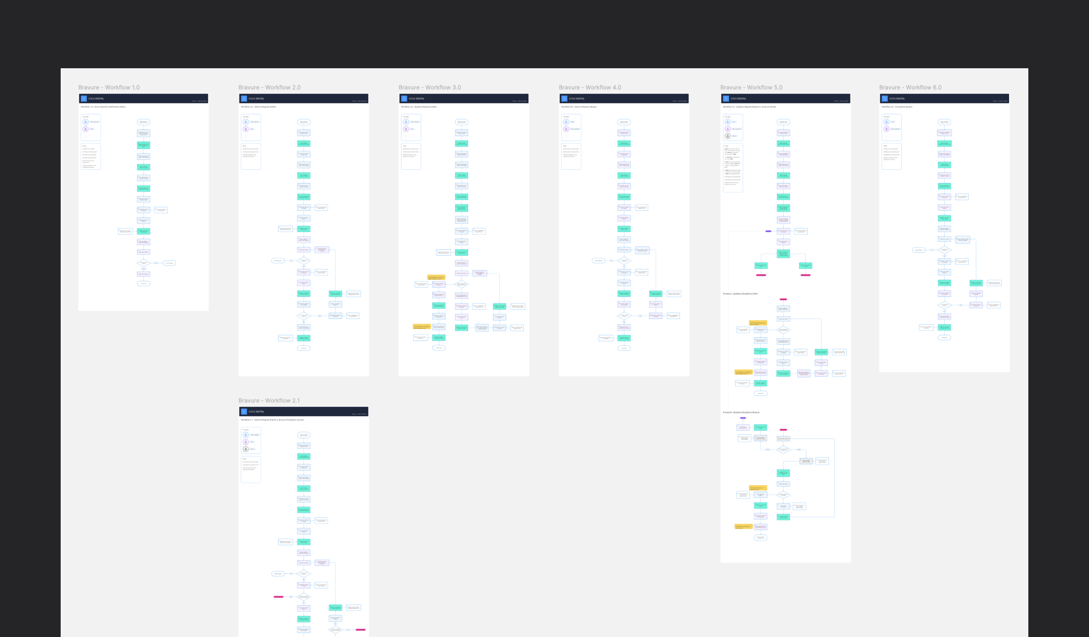
Workflows allowed me to account for multiple screens, templates and features.
Prototype testing
During my research phase (using a double diamond approach) I further tested some of our assumptions using rapid prototypes in Figma. This allowed us to actually see what was happening during the workflow process, and where in our designs we needed to make specific user considerations.
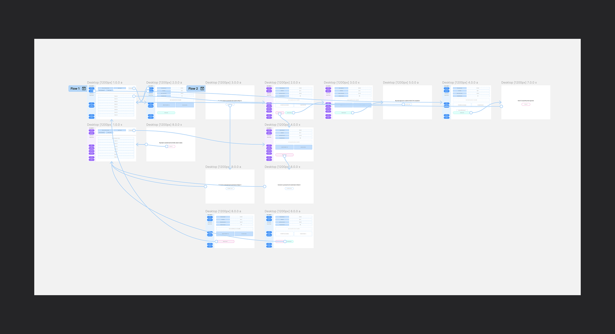
Multiple interactive prototypes used to test assumptions.
Design process
Before design could begin, I started by wire-framing the general layout of the platform, using a grid structure that allowed us to see all our pages, pop ups, and modals. Each page was number referenced, which correlated directly with our visual workflow processes.
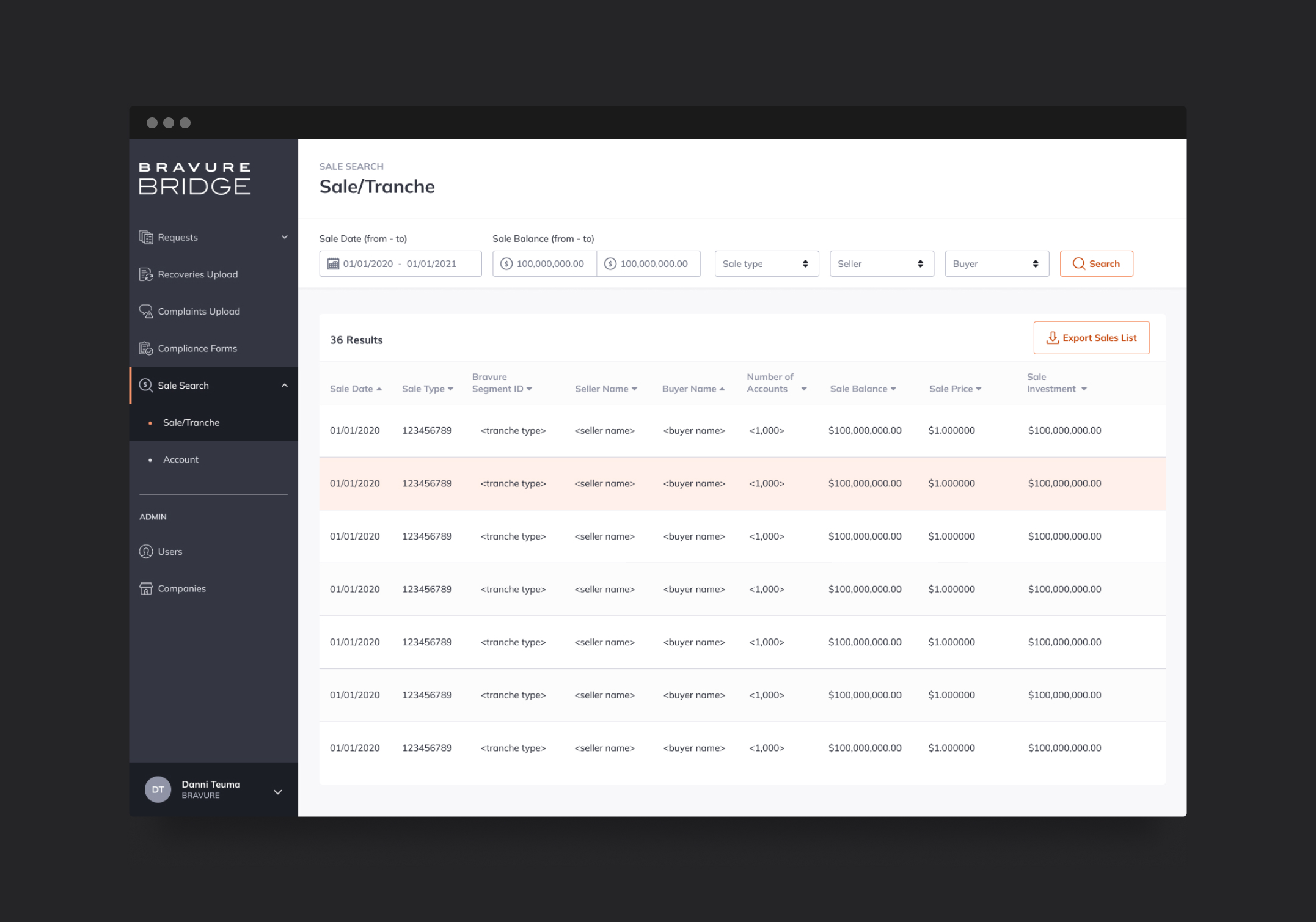
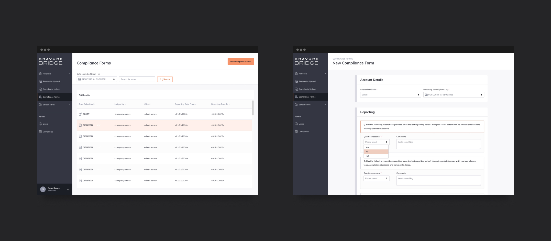
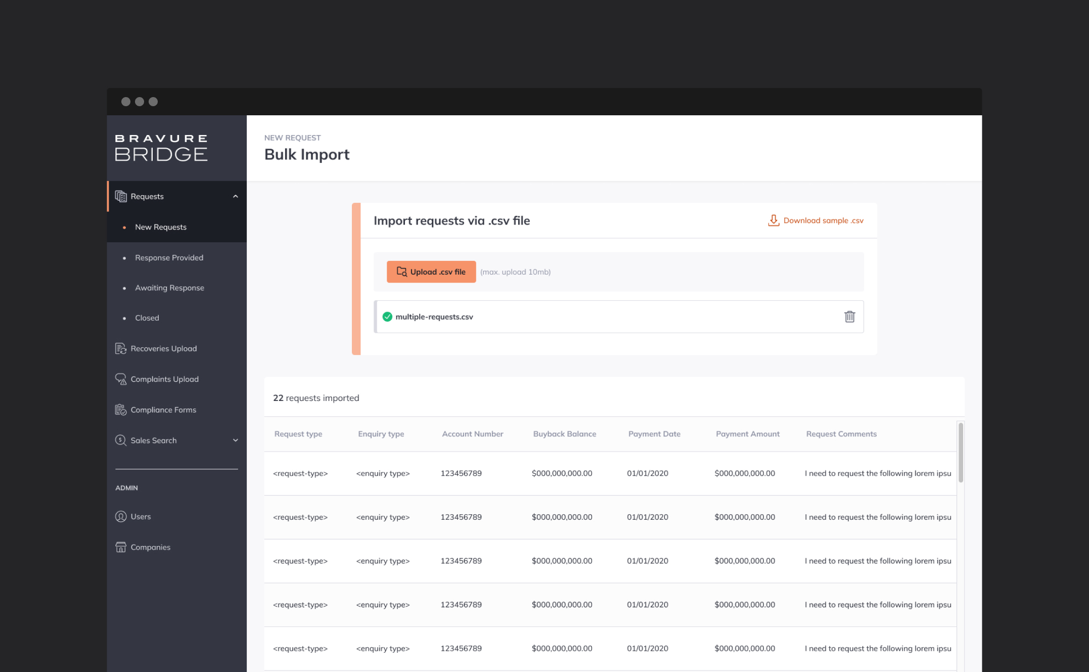
Once established, I then introduced a reusable design system/component library (which I had previously created to speed up design). This lean design system allowed me to quickly apply guidelines such as branded fonts and colours tokens/variables. The reusable component library allowed me to rapidly populate the pages with ready made objects and establish the design patterns required throughout the platform.
Sprint cycles
Working in 2 week sprint cycles, we regularly touched base with the client to run user acceptance testing (UAT). With the client being happy and confident we could then proceed with the next design and development sprint.
Colour challenge
One challenge we encountered was the use of the Bravure orange colour.
My argument was that the portal did not need to wholly adhere to their pre-existing colour scheme, and being a bespoke product, could use its own distinct accessible palette. Despite showing that orange was a challenging colour to use for accessibility reasons, the client was insistent that this colour must be used in accordance with their branding.
With this object set, I developed a new extended palette from the single orange, one that would meet a minimum of WCAG 2.0-AA accessibility standard on screen. This palette also complemented any secondary and tertiary colours for elements such as alerts. Pleased, the client approved the new palette and I was able to apply this rapidly to the design for review.
Bravure knew I had their best interests at heart, and wanting to build the perfect product for them, our goals were quick to align, highlighting the trust that I set out to build early on.
Outcome
After delivery of the product Bravure ran additional testing with a closed cohort of customers. Results from this testing revealed my careful planning, iteration cycles and continual contact with the client had paid off, leaving minimal changes needed to the platform before officially launching.
As a team we were extremely happy at the success of the project and at the clients response of Bridge’s success with it customers.
©Andy Firth | Designer + Creative Thinker. All rights reserved.