Octopus Deploy
Increasing designer productivity using better components.
Role / Process
Discovery and research
UX/Ideation
Design strategy
Design rollout
Developer collaboration
Ongoing support
Tools
Figma
Shortcut
GitHub
Whimsical
ZeroHeight
Octopus Deploy is established in the market place as a leader for continuous software delivery. As the product underwent new growth, a more robust, flexible component library was needed to support the various design teams.
My role
As a member of the Frontend Foundations team, my responsibilities entailed joint management and contribution to the new Design System and tokens, development of a new component library, as well as execution and support of many UX and UI updates to the product.
The problem
Shortly after starting at Octopus Deploy I identified a sizeable issue in our design workflow—product designers were using outdate or incorrect components in their concepts and prototypes.
Components were not flexible or scalable in designs, they were misaligned with what existed in code in both name and functionality, and contained no props or variables for component states. It was also common for designers to detach instances of components to manipulate them for their own needs.
Another identified issue was the lack of documentation. There was no way of knowing when, where or how a component should be used, let alone who created or managed the component.
Adding to the scale of the problem, components were not connected to the newly formed design system foundations, the core values that governed our design decisions, such as colours, typography and spacing.
Proposal
Armed with this knowledge, I developed a proposal to design and execute a rebuilt component library shared in Figma, one that integrated seamlessly with our new design system foundations, and allowed for flexibility, scalability and ongoing contribution.
Starting from scratch
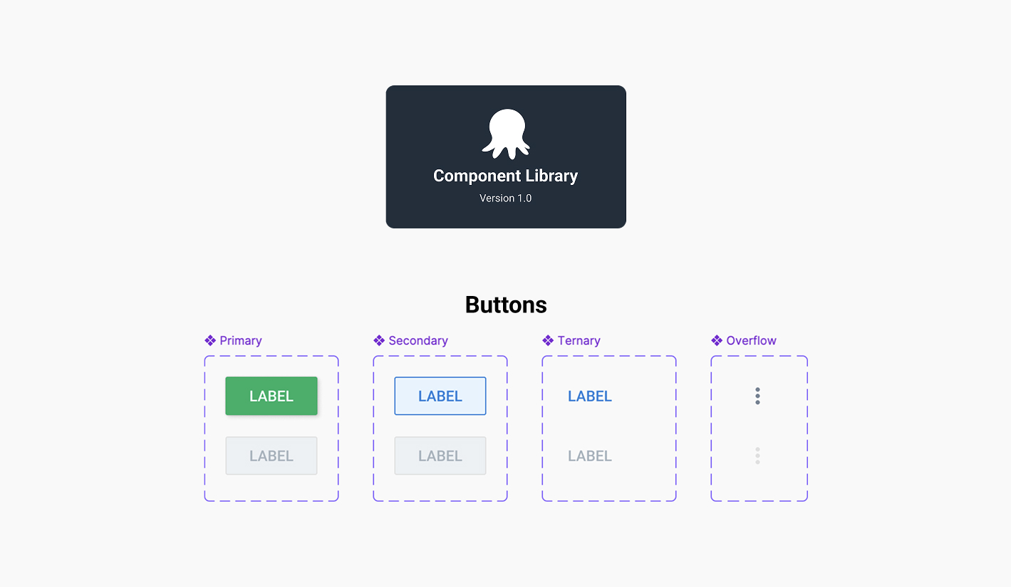
With these issues present, it was clear we needed to build a new component library. Designers were crying out for something that was more usable and up to date.
With projects currently in flow we decided to move quickly and create a component library that could be used early but allowed for continual updates that supported designers.
Requirements and MVP
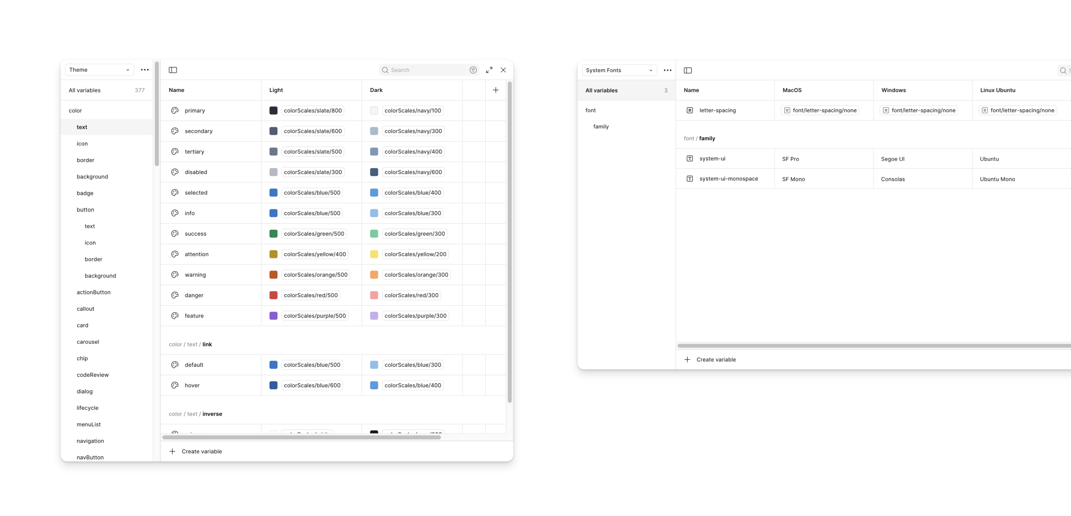
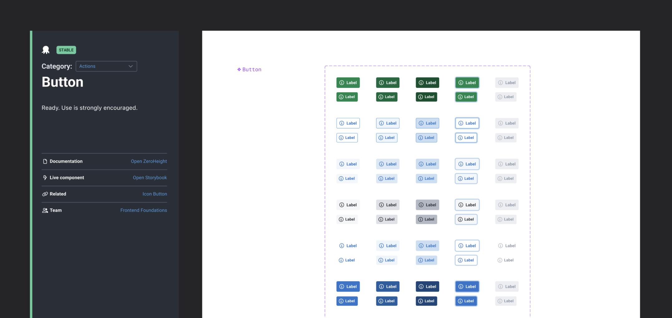
Our new component library would take the form of a single master file, connected to our Foundations using Figma’s newly introduced Variables feature. Components would then be published to the shared library, allowing access in any design file and easily updated when changes were made.
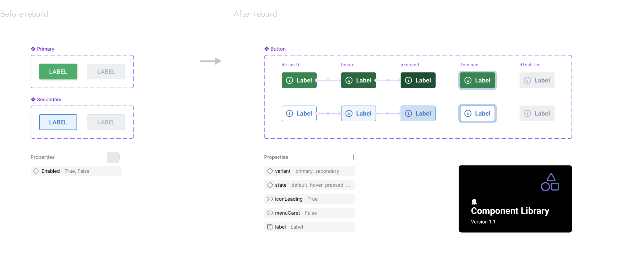
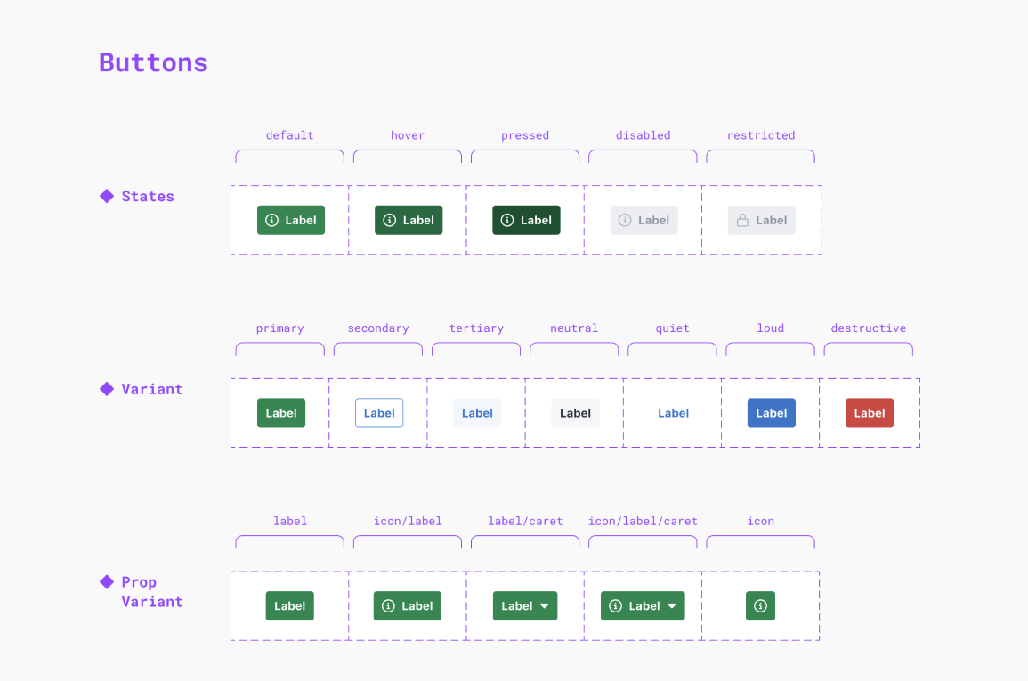
Using the Button component as a starting point, we identified a series of minimum requirements that would help guide us along. These included:
- Flexibility - components should respond consistently to placement and content
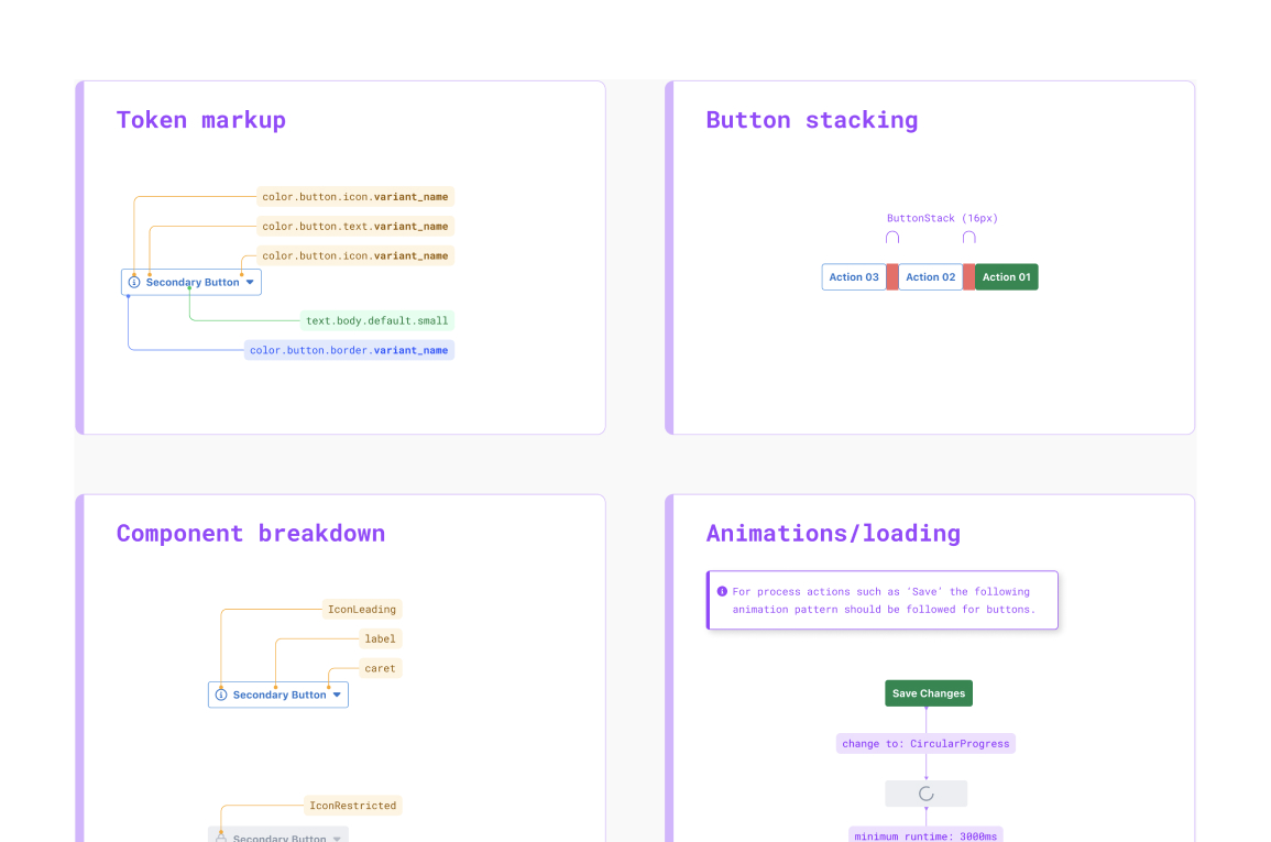
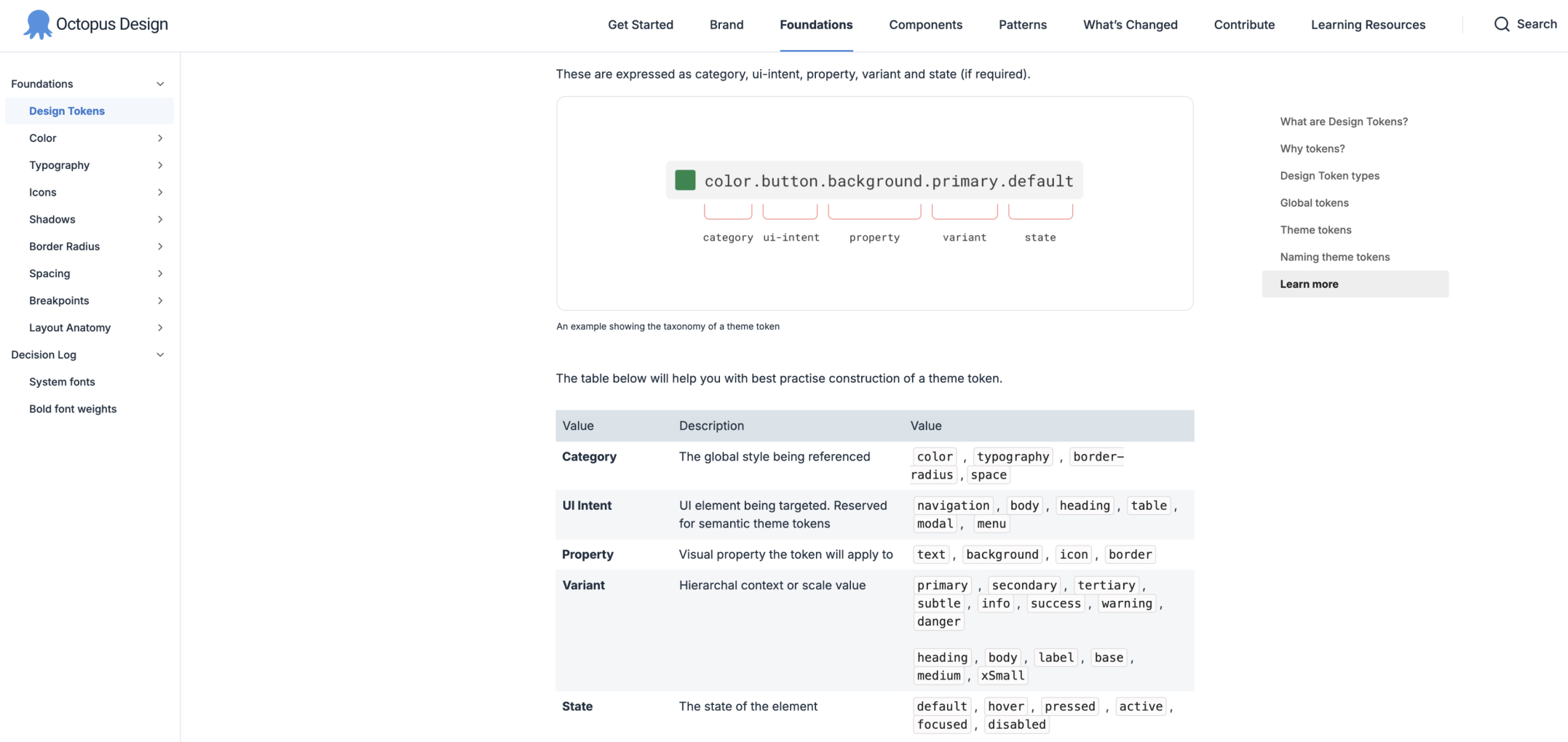
- Theme - would work in light and dark mode themes using semantic variables/tokens
- Accessibility - meet a minimum accessibility of WCAG 2.1 AA
- Properties - had the appropriate states applied and available as props in Figma
- Consistent layer naming and conventions for bulk editing
- Prototype - interactions, if any, should work in prototypes and testing
- Documentation - usage clearly documented in an understandable way.
We also integrated tokens as a code-based JSON theme that could be seamlessly updated to the front-end framework using Figma via GitHub pull requests.
Component gap analysis
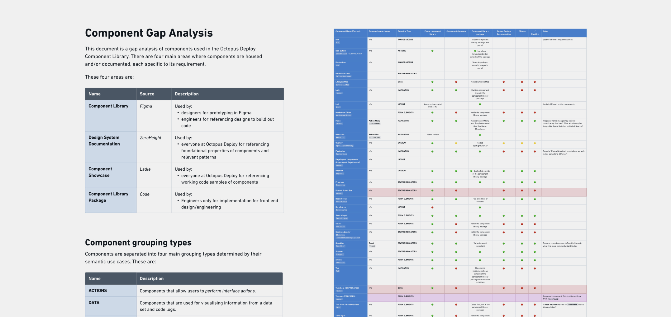
As the component library work progressed over time, I undertook a detailed Component Gap Analysis to evaluate the growing question of alignment between design assets and their code-based counterparts. This analysis surfaced critical discrepancies—highlighting high-risk areas where components were either missing, inconsistent, or implemented differently across design and development.
To address these gaps, I facilitated a series of workshop sessions with our team. These sessions helped us collaborate and prioritise areas for improvement, align on shared standards, and define a clear path to close the gaps between design and code.
In addition to resolving immediate inconsistencies, the analysis also uncovered areas of potential design and technical debt. These insights were documented and communicated to relevant ownership teams and stakeholders, enabling informed decision-making and proactive planning.
The analysis also led to the development of a rigorous contribution model. This meant any individual or team adding new components either in design or code needed to meet a minimum set of requirements before acceptance was approved.
Supporting designers—Improving productivity
The new component library proved a success with 100% adoption across the design team. This included a massive reduction in detached components.
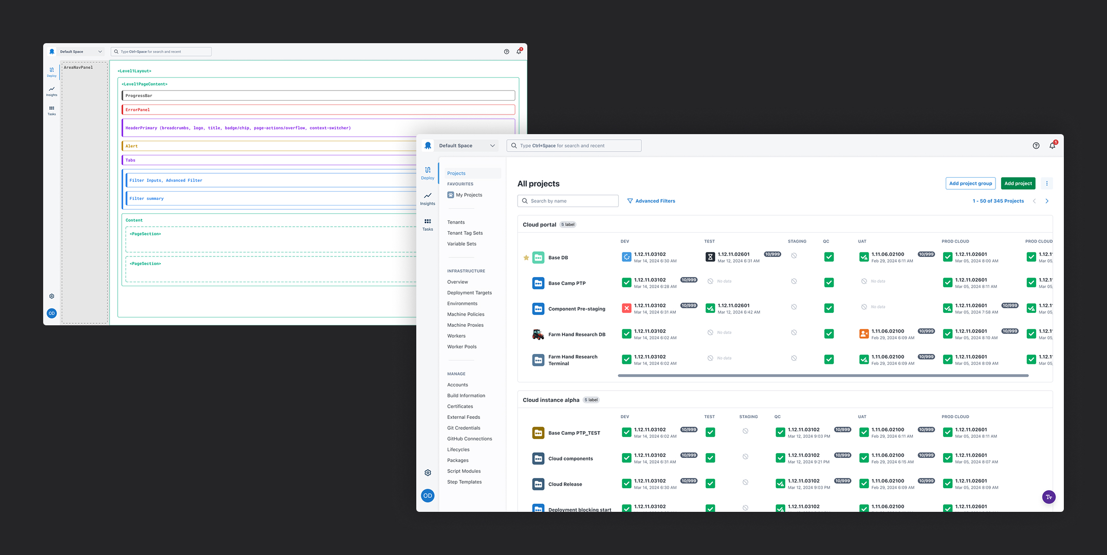
As part of the ongoing support, I designed a series of fully templated screens that allowed for rapid development of prototypes, further reducing design time. The screens used a layered scaffold template that guided designers on where components could only exist to meet consistency rules in the front-end code.
All screens supported light and dark themes, native system fonts, and realistic clickable components allowing interaction testing to feel like a native experience.
©Andy Firth | Designer + Creative Thinker. All rights reserved.