Review by Social Ventures Australia
Improving youth employment with data.
Role / Process
UX strategy
UI strategy
Design rollout
Developer collaboration
QA and UAT
Client liaison
Tools
Figma
Shortcut
Google Docs
Excel
Pen & Paper
Young people in Australia are more than twice as likely to be unemployed than the rest of the working age population. Social Ventures Australia work to deliver better employment outcomes for young people by helping organisations develop more effective youth employment initiatives.
Soda Digital was engaged to develop a series of online survey tools which are taken by participants at varying intervals of their work program. The survey data is then fed into a bespoke portal which provides program facilitators with clear visual data, allowing them to better tailor employment programs.
My role
As senior designer I was tasked to design the facilitator portal and survey tools. This began with UX research with the client, the development of site maps and workflows, wireframes and prototypes with UAT through to final design and collaborative developer hand-off.

Research and testing
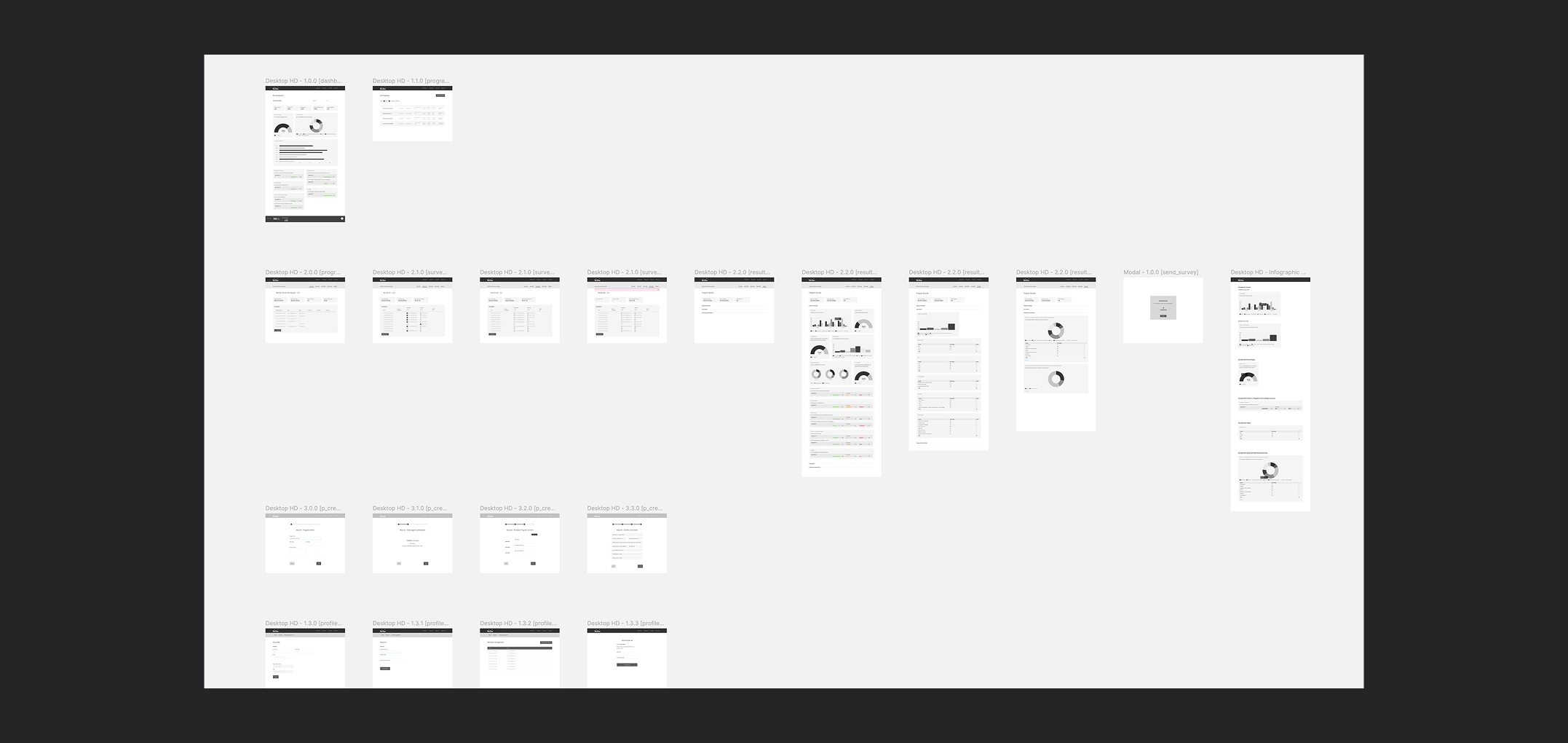
With initial research already conducted by the client, I still needed to understand the workflow of the platform. Starting with a site map and information architecture we were able to plan out what was required of the portal but also challenge any assumptions with the research provided.
The site maps provided a visual reference for us to create rapid prototypes that could be tested. Through this approach I was able to isolate unaccounted steps in the workflow to present back to the client and minimise any ‘gotcha’ moments later in the process.

IA workflows where developed to model test with the client.

Initial wireframes used in prototypes.
Planning and execution
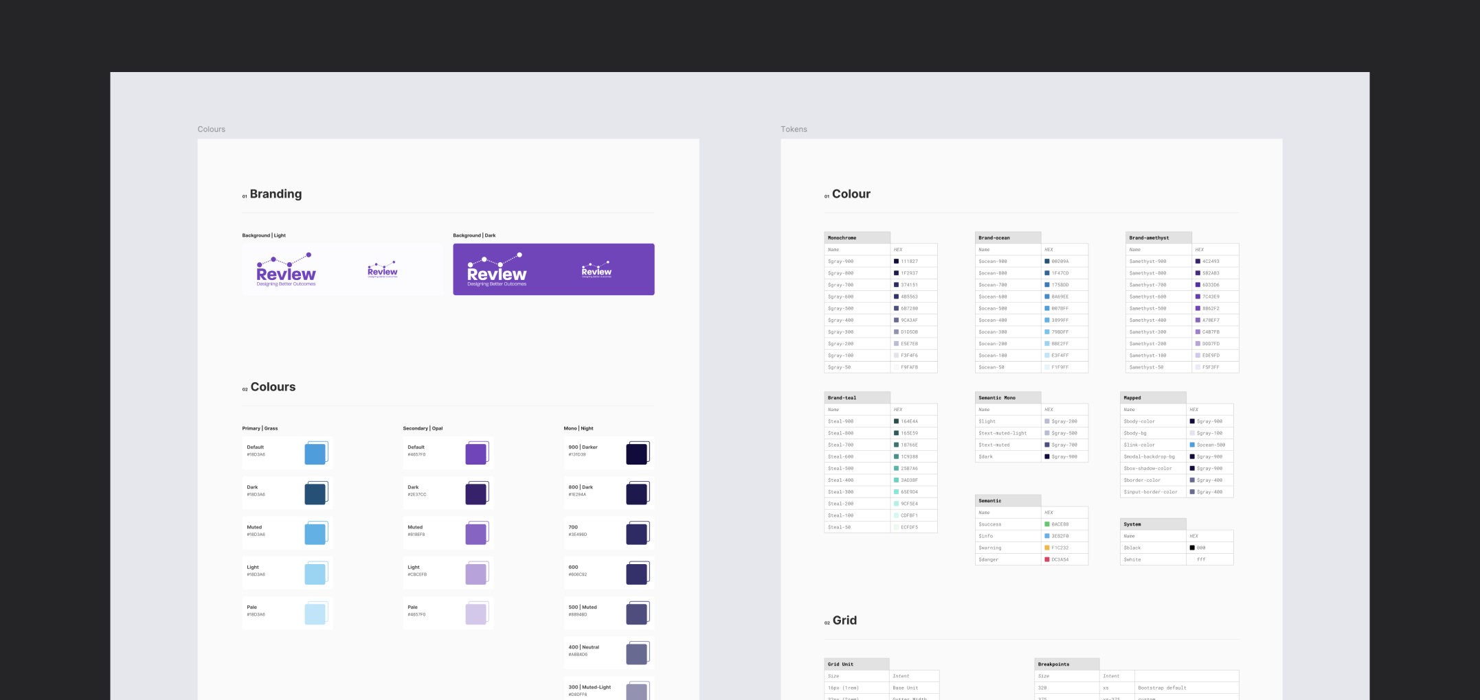
When developing the survey program we needed to be acutely aware of the users experience. Strong considerations were needed where english skills might be lower than average, such as literacy, or where english was not the first language. While multi-lingual support was not available in-app, it was provided as a physical side-by-side service. We supported this by using clear legible text (WCAG 2.1) and a bright colour palette for the sliding Likert scales while adhering to brand colours.
Surveys where captured and stored in a SQL database which I translated into visual data using Charts.js. The portal was to built using the Bootstrap framework underneath.

Constant collaboration and testing
The success of Review came from constant collaboration and testing with the team and stakeholders. Regular check-ins allowed us to be agile and pivot when needed, and built a strong trust with the client.
From the outset I worked closely with both front and back-end engineers. Back-end engineers allowed me to understand the data being captured and how best to visualise it, while front-end engineers allowed us to find the right technologies, such as Chart.js, to bring those visuals to life.
Through sprint cycles we were able to ensure we met key milestones to maintain a high standard.

Results captured by web-survey are output as metrics for admin.


Outcome
Working with a non-for-profit organisation was a hugely rewarding experience. Our challenges were many, building two separate tools that would work in tandem to provide a holistic experience.
Having developed a great working relationship with the client and its initiative, we were proud to continue support and the development of additional features when the program budget was expanded as part of its success.
©Andy Firth | Designer + Creative Thinker. All rights reserved.