Octopus Deploy — Design Systems.
Digital Strategy. UX/UI Design.
Octopus Deploy has established itself as a leading solution for continuous software delivery. As the product continues to evolve, the need for a more robust and scalable design system became essential to support future growth.
As a member of the Frontend Foundations team, I contributed to the development of this design system—spanning visual and written guidelines, the creation of a modern token library, and the redesign of a component library accessible to all designers across the organisation.
Playing a role in laying the foundational infrastructure that enables the product to mature and scale has been an incredibly rewarding experience.
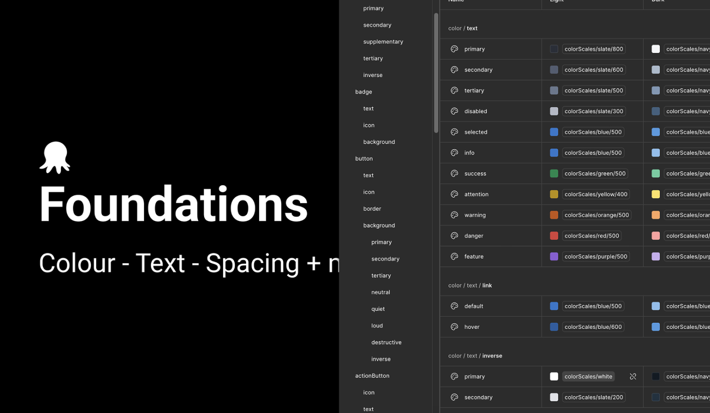
Building a Design System
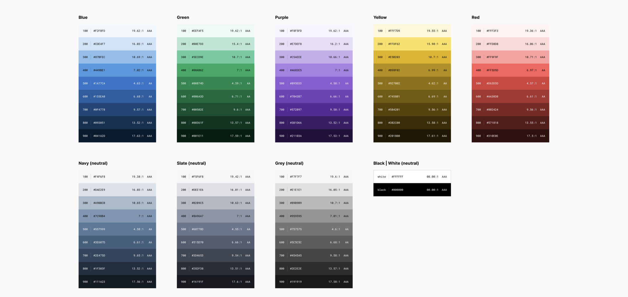
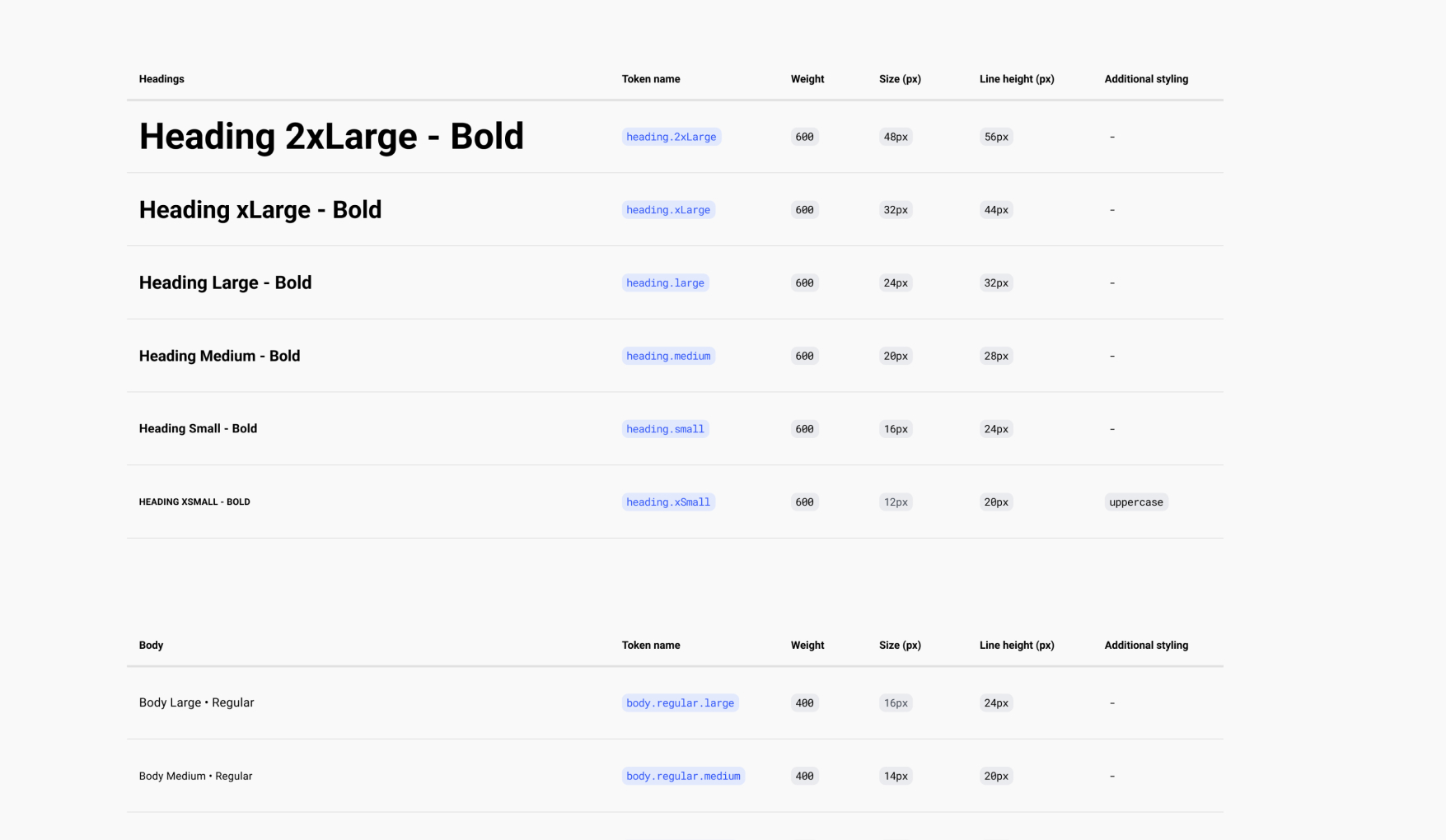
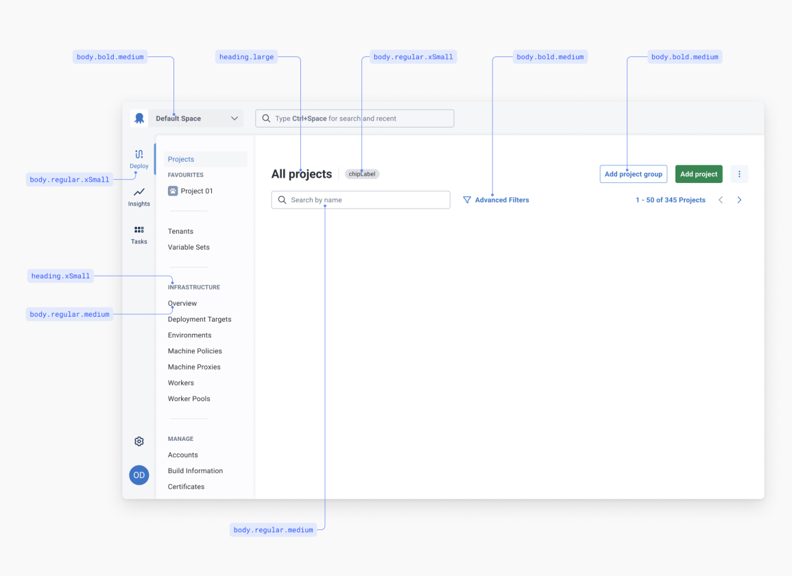
Our implementation strategy began with defining the core design primitives — typography, colour palette, spacing, and elevation. These foundational elements were carefully honed to ensure consistency, scalability, and alignment with brand guidelines.
From there, I helped developed a comprehensive token library, implemented as a code-based (.json) theme to integrate seamlessly with the UI framework. This theme allowed for seamless light/dark modes all managed from our Figma libraries, enabling centralised control of design decisions and facilitated with rapid iteration across the platform.
All foundational styles were rigorously tested against WCAG 2.1 AA accessibility standards. This included validating colour contrast ratios, font legibility, and interactive element spacing, ensuring the system met the needs of our users.
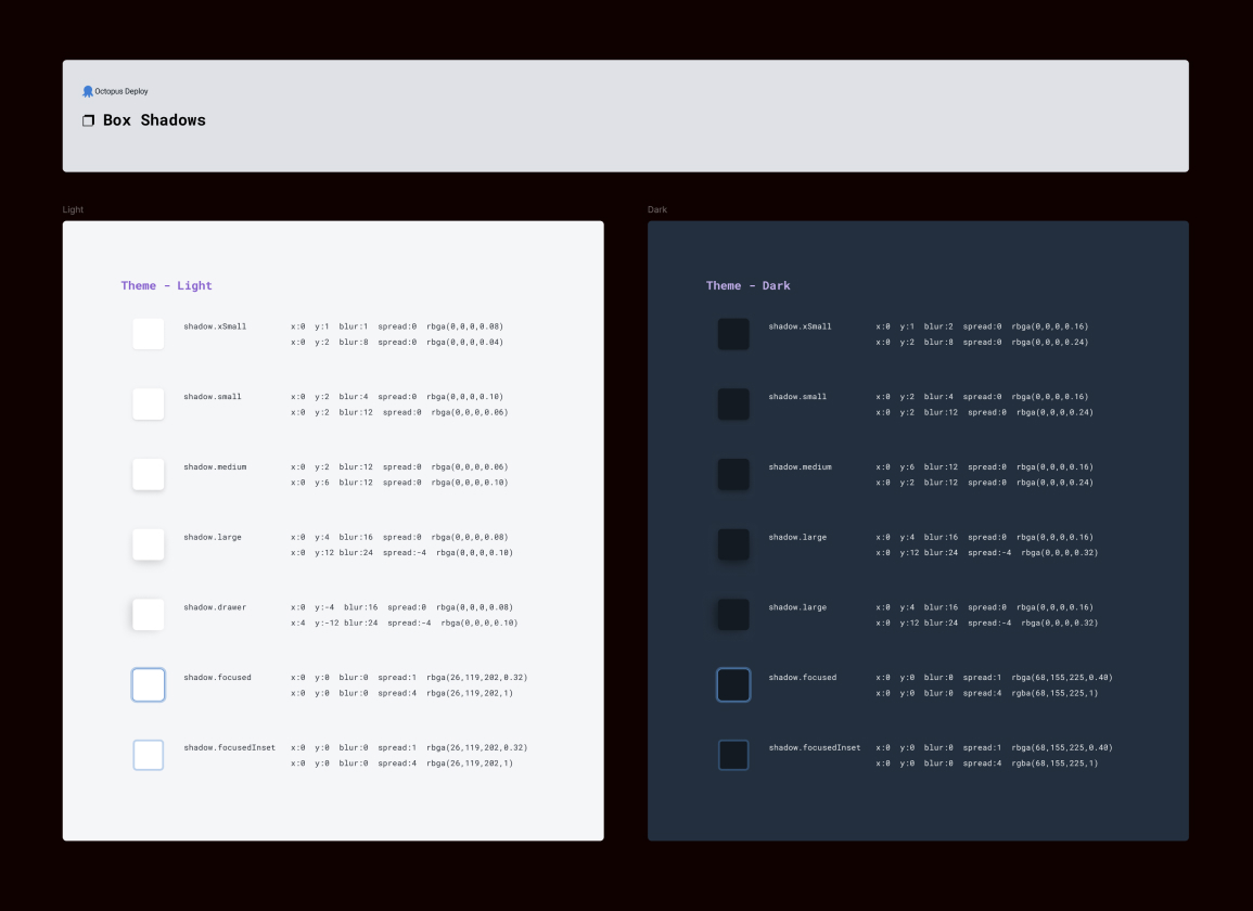
Soon after joining Octopus Deploy, I identified significant limitations in the existing component library. Many Figma files across the design teams were relying on outdated or broken components and deprecated styles, leading to inconsistencies and inefficiencies in the design process.
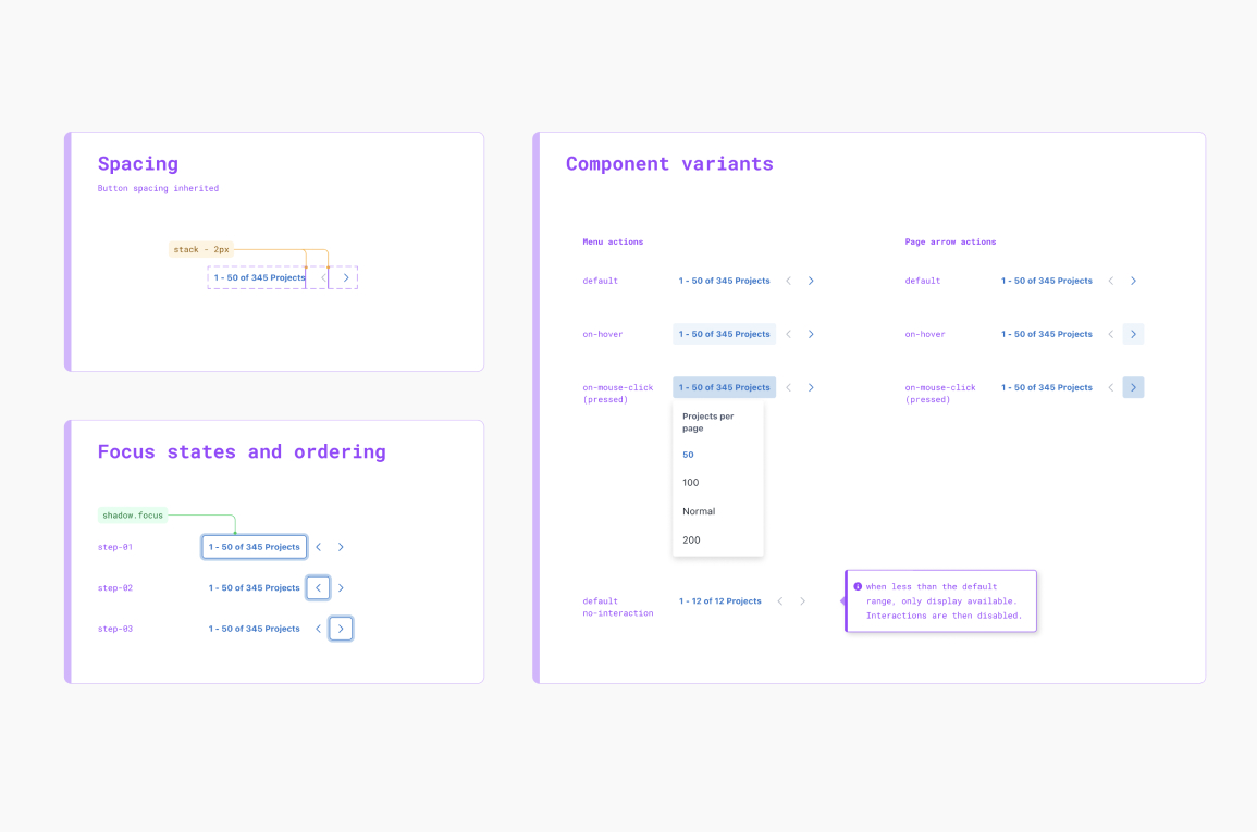
Recognising the impact on scalability and team productivity, I proposed and led the development of a new, unified component library. Built in Figma, this new library was tightly integrated with our foundational styles and tokens, enabling greater consistency across the product and empowering designers to contribute new components more efficiently.
By linking the foundations and components within Figma, we created a scalable, modular system that supported rapid design iteration, improved team collaboration, and laid the groundwork for a more cohesive and maintainable design system.
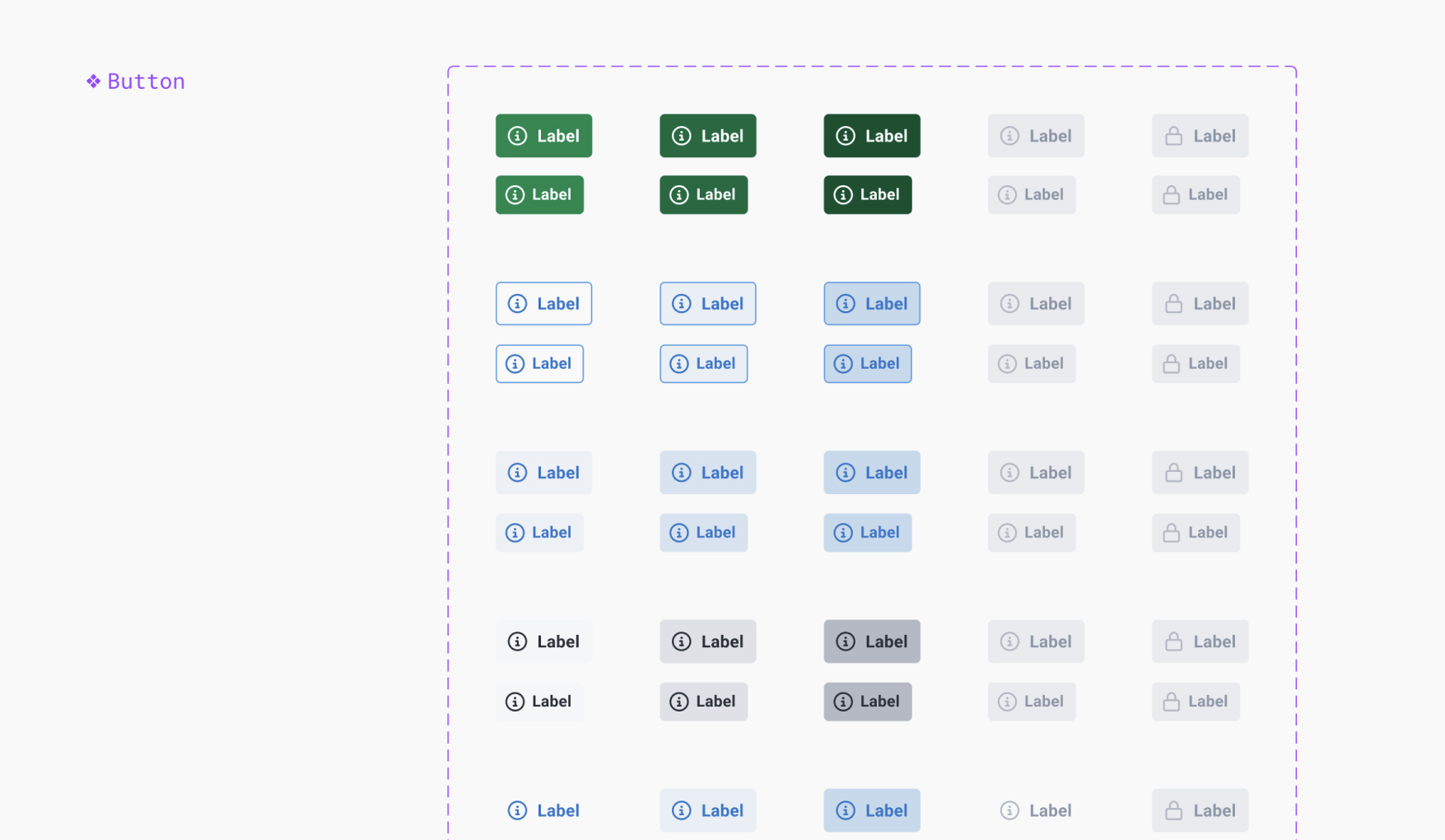
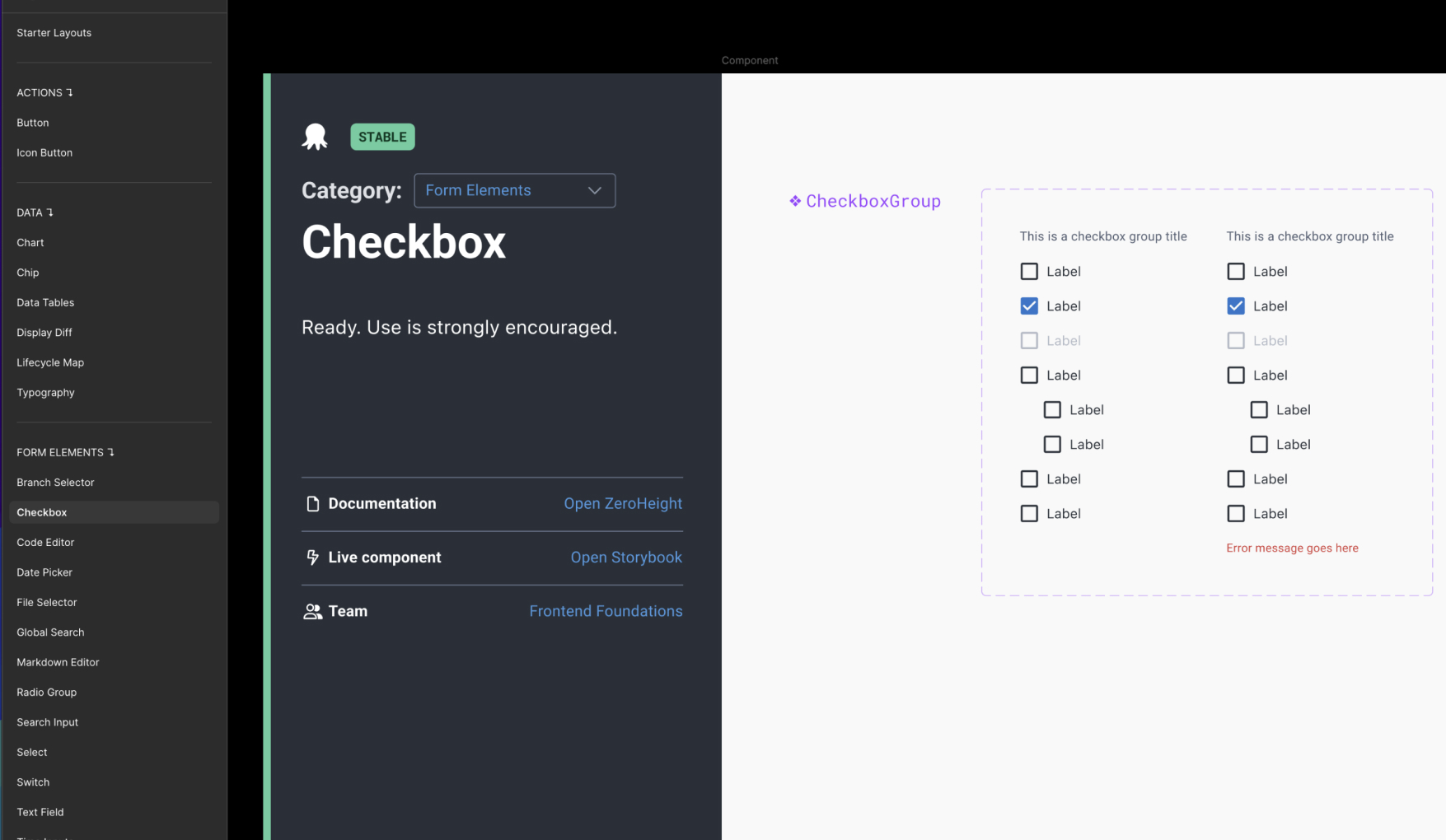
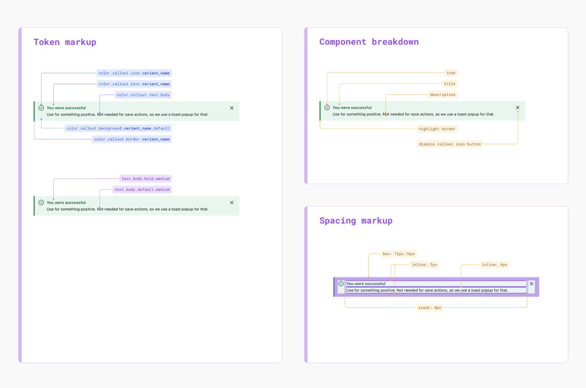
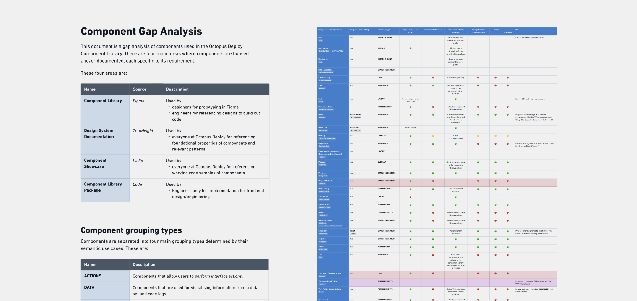
As the design system initiative progressed, I undertook a detailed Component Gap Analysis to evaluate the alignment between design assets and their coded counterparts. This analysis surfaced critical discrepancies—highlighting high-risk areas where components were either missing, inconsistent, or implemented differently across design and development.
To address these gaps, I facilitated in workshop session within our team. These sessions helped us collaboratively prioritise areas for improvement, align on shared standards, and define a clear path to close the gaps between design and code.
In addition to resolving immediate inconsistencies, the analysis also uncovered areas of potential design and technical debt. These insights were documented and communicated to relevant ownership teams and stakeholders, enabling informed decision-making and proactive planning.
©Andy Firth | Designer + Creative Thinker. All rights reserved.